
320H.1 - Introduction to React
Learning Objectives
By the end of this lesson, learners will be able to:
- Describe why React is so popular and in high demand.
- Describe the history of React.
- Describe what is React in terms of code organization.
- Explain what "JSX" is.
- Create and style React components.
- Use standard JavaScript patterns with React.
- Import and export React components across files.
- Build a simple React app.
React
React is a free and open-source front-end JavaScript library for building component-based user interfaces.
React is not a full Model-View-Controller (MVC) framework like some other front-end frameworks you may have heard of or are familiar with, like Next.js (which uses the React library). React is simply a library that encourages and facilitates the creation of reusable UI components that present data which can change over time.
React was created by Jordan Walke, a software engineer working at Facebook at the time, in response to the company's growing need for providing a more dynamic, more responsive interface that was also fast, scalable, and highly performant. React was released in 2013, and has since been maintained by Meta and a large community of contributors.
Since its release, React has become one of the most popular front-end development tools in the world. This popularity can be attributed to the fact that React is:
- Simple to read and easy to use.
- Designed for easy maintenance.
- Robust, interactive, and dynamic.
- Easy to test.
- Cross-platform via React Native.
There are many concepts and terms that you need to be familiar with in order to be a successful React developer. In this lesson, we'll look at the following key concepts:
- Separation of Concerns
- Component-Driven Development
- Beginning with the End in Mind
- Declarative Programming
- The Virtual DOM
- React Developer Tools
- Components
- JSX
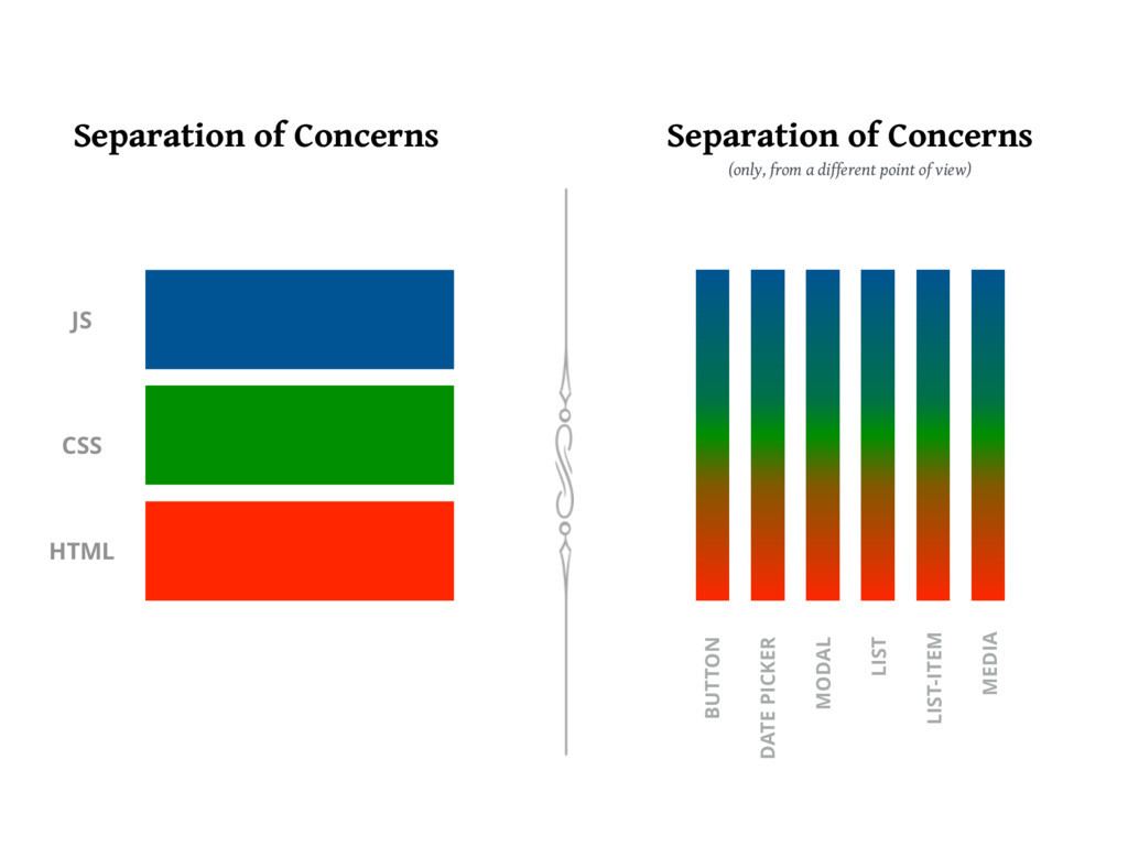
Separation of Concerns
Separation of concerns in web development is the practice of breaking down a web application into distinct parts that each handles a separate concern, such as the user interface, business logic, and data access. This helps to improve maintainability, scalability, and reusability of the application.
Traditionally, the front-end is separated into:
- HTML: Structure
- CSS: Presentation
- JavaScript: Functionality
With React and component-driven development, our seperation of concerns looks a bit different:
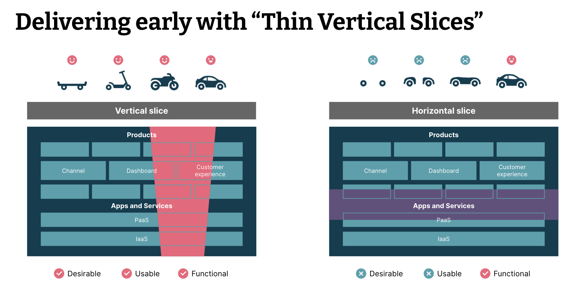
Thin Vertical Slices and User Stories
This differing approach is also known as "thin vertical slices." When approaching milestones, goals, benchmarks, or deadlines, there are many different ways to measure "success." When success is defined in terms of thin vertical slices, it means each deliverable should encompass a small but fully-functioning feature that covers all of the "horizontal" aspects of the platform.
In our case, this means creating "components" that have layout, styling, and functionality, but in the larger context of programming, vertical slices can span the entire frontend, backend, and databases.
It is important to remain organized when planning and executing your development tasks. Breaking your tasks down into thin vertical slices can help you understand how to better approach the challenge in front of you, especially when it is a large-scale project. Here, we will introduce you to a few tools that may aid in this process. While these tools are presented in the context of React, they can be used across programming languages and even in non-technical contexts.
Depending on the development methodology used by your team, you will come across different terms to describe these tasks. In agile methodology, one of the most popular for technology teams, you will hear these tasks referred to as "User Stories." User stories are descriptions of a functionality goal from the end-user perspective, written casually so as to facilitate clear communication and development.
User stories typically follow a pattern that looks something like:
As a <role>, I want <functionality> so that I can achieve <outcome>.A user story can be as simple as:
As a learner, I must be able to upload the results of my assignments so that I can receive credit for my work.This is a vertically sliced story, since it encapsulates an HTML upload field, styled with CSS, with the functionality to upload to a server. This particular story also includes elements of server processing and database access, making it a true vertical slice.
User stories also contain acceptance criteria, which details the functionality required for the story to be considered "done." In our example, we might have the following acceptance criteria:
- Verify that I can upload a file or link.
- Verify that the file or link is stored in the database.
- Verify that I can remove and replace an upload.
It is also recommended that user stories follow the INVEST mnemonic:
- Independant - Each story should be self-contained.
- Negotiable - Stories should leave space for discussion, not create strict contracts.
- Valuable - A story must deliver value to stakeholders.
- Estimatable - You must be able to estimate the size of a story.
- Small - Stories should be small enough to be able to plan, task, and prioritize accurately.
- Testable - Stories should provide the information necessary to make test development possible.
Following these guidelines when developing your own tasks and checklists can help you keep things manageable and actionable, and avoid getting overwhelmed.
Here's a few examples of the difference between horizonally sliced tasks and vertically sliced ones:
- Horizontal - Modify CSS to add drop shadow to all
<img>elements. - Horizonal - Build an HTML table to store dates and data ranges.
- Horizontal - Create an event handler for form submission.
- Vertical - Create a data table that fetches from our API to display user data.
- Vertical - Add filters to change data display between date, location, and financial impact.
- Vertical - Create edit fields to allow data modification and upload.
Note that these are tasks, not complete and well-structured user stories. Notice, however, that the vertical slices give us a complete view of the task's outcome, whereas the horizontal slices leave us asking "why?" Now that I've built this HTML table... is it just going to sit there, empty?
It is very important to keep in mind we started this section by discussing thin vertical slices. Consider the following:
- "As a user of this travel site, I would like to see the list of flights between the two selected cities, with total, tax-inclusive prices."
While this may seem like a well-formed vertical user story, the complexity hidden within it does not align with our "thin" vertical slice ideal. In order to implement something like this, you would need to integrate between all of the airline reservation systems, calculate taxes based on the user's location of residence, consider performance implications of various features and elements, etc. While this could all be accomplished, it would take more than one iteration to do so.
Here's a visual to help solidify the vertical slice concepts we've discussed so far.
We could spend a lot of time discussing development methodology concepts, but that is beyond the scope of this particular lesson. For now, just try to understand the basic concepts of vertical slicing.
Component-Driven Development
In order to facilitate these vertical slices, React takes an approach called "Component-Driven Development."
Component-Driven Development (CDD) is an approach to web development that makes use of reusable components to create a user interface. It is based on the React JavaScript library and is used to create interactive websites, mobile apps, and other user interfaces.
- CDD makes use of reusable components, or “widgets”, to create a user interface.
- Each component is responsible for rendering a specific part of the user interface, and components can be composed together to create a complete user interface.
- React components are written using JavaScript, and the React library provides a set of tools to help developers create and manage components.
- CDD also makes use of a declarative programming style, which makes it easier to write code that is easy to maintain and debug.
- React's component-driven architecture encourages developers to write modular code, which makes it easier to reuse and update components.
- React supports server-side rendering, which allows developers to create faster and more responsive user interfaces.
Components
A React app's UI consists of components. We build an app's UI by composing built-in and user-defined components.
React's built-in components are often referred to as React Elements and are used to emit actual HTML elements like <div>, <h1>, etc into the HTML page DOM. The custom components we code are going to be used a lot like HTML tags. For example, in the diagram below, the UI is being built with tags like <HomePage>, <SearchBar>, <EmployeeList>, etc.
Our React components must contain React Elements if we want anything to appear on the page.
- React Elements can be styled using CSS.
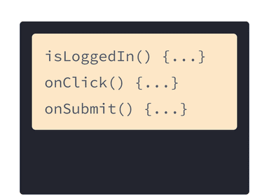
- React Elements will also be the components that we add event listeners to for responding to user interaction.
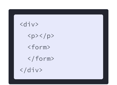
- Components that create the UI are created using 100% JavaScript; there is no HTML markup in React components.

So what does a component look like? Components are defined by functions, like this:
function PerScholasLogo() {
  return (
    <img
      src="https://perscholas.org/wp-content/themes/per-scholas/assets/images/logo1.svg"
      alt="Per Scholas"
    />
  )
}
They can then be integrated into an application like this:
Components must always start with a capital letter or they will not work.
There is also a class-based syntax for React components, but the functional syntax is considered the more modern approach. Master functional components first, and familiarize yourself with the class syntax later if working with older codebases.
This looks like it has HTML markup! It does not, though. This is a special HTML-like syntax called JSX, which we will discuss in the next section.
When building a website, we use HTML to structure webpages, CSS to style them, and JavaScript to make them dynamic and interactive. React components give us a way to combine markup, CSS, and JS into custom components that become reusable UI elements for your application.
For example, we could take that PerScholasLogo component above and nest it into a component tree just like we would with HTML.
The HTML for a simple table of contents might look like this:
<article>
  <h1>Learning React with Components</h1>
  <ul>
    <li>Components: UI Building Blocks</li>
    <li>Defining a Component</li>
    <li>Using a Component</li>
  </ul>
</article>
If we stored that HTML structure in a React component instead, called TableOfContents, we could then create an entire webpage of components as simply as:
<PageContainer>
  <Navigation>
    <PerScholasLogo />
    <SearchBar />
    <Login />
  </Navigation>
  <Sidebar />
  <ContentContainer>
    <TableOfContents />
    <Article />
    <Article />
    <Article />
  <ContentContainer />
</PageContainer>
If we expanded each of these individual components into their resulting HTML markup, the results could be many, many lines, not to mention the inclusion of CSS and JavaScript. Breaking things down into components helps keep everything manageable and scalable.
We'll go into more detail on the syntax and usage of these components shortly, so don't worry if they look a bit strange at the moment.
JSX
Although a React component's UI is ultimately defined by JavaScript, there is a better way to define the UI using a special syntax known as JSX:
- JSX is an XML-based syntax that looks like HTML (as it should, since HTML is also based on XML).
- Since our browsers do not understand JSX, it must first be transpiled (converted) into pure JS, but this is handled for us in the background.
The following is an example of JSX:
const element = <h1>Hello, world!</h1>;Note that this tag syntax is neither a string or HTML. JSX is an expression, and can be used like one.
It can be used inside of conditional statements and loops, assigned to variables, accepted as arguments, and returned from functions.
JSX and React move web development into the modern era by combining markup with interactivity. For many years, content design, markup, and logic lived in separate files because static or minimally interactive webpages were the standard. Now, web applications are expected to have dynamic interactions built into their core design.
Here's an example of how things used to be, taken from the React documentation:
HTML and JavaScript were separated from one another, often resulting in confusion during development of large or complex projects.
Now, frameworks like React merge rendering logic and markup together into one place - components.
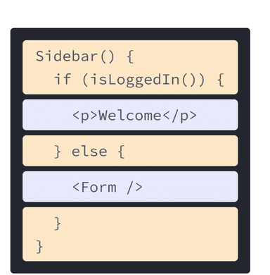
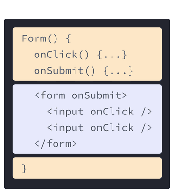
Keeping rendering logic and markup together ensures that they are always in sync, and keeping details that are unrelated separate makes it safer to change each of them on their own. In the example above, the sidebar and the form have nothing to do with each other, so why should their code be mixed? Isolating components helps ensure maintainability and scalability.
There are several rules to keep in mind when using JSX...
#1 - Only One Top-Level Element
You can only have one top-level element in a JSX expression.
GOOD: The <div> is the only top-level element.
<div>
  <h1>Hello World</h1>
  <p>lorem ipsum</p>
</div>
BAD: The <h1> and <p> are both at the top-level; this will cause an error.
<h1>Hello World</h1>
<p>lorem ipsum</p>
ALSO GOOD: If you really don't want to wrap the content in a <div> you can use an empty tag (<> </>), which is called a "fragment." In older code, you may see this written as <React.fragment>, but this is no longer necessary.
<>
  <h1>Hello World</h1>
  <p>lorem ipsum</p>
</>
#2 - Attributes are camelCase
All HTML attributes become camelCase when writing them in JSX:
onclickbecomesonClick.onchangebecomesonChange.onSubmitbecomesonSubmit.classbecomesclassName(because theclasskeyword is already used in JavaScript).
You get the idea.
#3 - Inline Styles in JSX Need to be Wrapped
In normal HTML, an inline style would be written like this:
<div style="display: flex; background-color: blue;">Hello World</div>JSX is not** HTML, it is just an HTML-like abstraction over JavaScript's DOM API. When writing inline styles, you are dealing with the style object of the DOM node. So instead of a string, you pass an object that will be merged into that node's style object. Since it's JavaScript, all of the CSS style attributes are now camelCase instead of hyphenated.
<div style={{display: "flex", backgroundColor: "blue"}}>Hello World</div>We will discuss why we need two sets of curly braces shortly.
#4 - Arrays Work
You can pass arrays of JSX if you want.
return [<h1>Hello World</h1>, <h1>Hello World</h1>, <h1>Hello World</h1>]The above code block is the same as me writing:
return (
  <>
    <h1>Hello World</h1>
    <h1>Hello World</h1>
    <h1>Hello World</h1>
  </>
)
This becomes particularly powerful when dealing with large lists of data. As an alternative, certain array methods like map() work well with JSX, which we will discuss shortly.
#5 - JavaScript Expressions can be Injected
Since JSX is a special way of writing JavaScript code, we need a way to define "true" JavaScript inside of our JSX. For this purpose, we can use curly braces in JSX to enable JavaScript expressions.
For example, if we wanted to calculate a value within our JSX:
return <h1> I am {30 + 5} years old </h1>Or if we wanted to dynamically control a certain output:
const name = 'Jane Doe';
const element = <h1>Hello, {name}</h1>;
Remember our double curly braces from Rule #3 on inline styling? The first set of curly braces indicate that we are using a JavaScript expression, and the second set define the object literal within that expression.
Here's an example that doesn't change the behavior from our previous PerScholasLogo component, but uses JavaScript to handle attribute values in a different way:
function PerScholasLogo() {
  const imgURL = "https://perscholas.org/wp-content/themes/per-scholas/assets/images/logo1.svg";
  const alt = "Per Scholas";

  return (
    <img
      src={imgURL}
      alt={alt}
    />
  );
}
Any JavaScript expression will work inside of the curly braces, including function calls!
You can only use curly braces inside of JSX in two ways:
- As text directly inside a JSX tag:
<h1>{name}'s To Do List</h1>works, but<{tag}>Gregorio Y. Zara's To Do List</{tag}>will not. - As attributes immediately following the
=sign:src={imgURL}will read the imgURL variable, butsrc="{imgURL}"will pass the string"{imgURL}".
#6 - Everything Must Close
In HTML, we have some self-closing tags like <img> which do not require an accompanying closing tag (</img>).
In JSX, everything must close. You can choose to use the self-closing format or include a matching closing tag.
<App>
  <Header />
    <Content>
      <Post />
      <Post />
      <Post />
    </Content>
  <Footer />
</App>
Now that we know a bit more about the syntax behind React components, let's look at a slightly expanded example. Here, we'll create a Gallery component that is composed of several PerScholasLogo components, which we've styled using JSX inline styles.
Here's what the browser sees from an HTML perspective in this example:
<h1 style="text-align: center;">Per Scholas</h1>
<img src="https://perscholas.org/wp-content/themes/per-scholas/assets/images/logo1.svg" alt="Per Scholas" style="display: flex; margin: 1em auto;">
<img src="https://perscholas.org/wp-content/themes/per-scholas/assets/images/logo1.svg" alt="Per Scholas" style="display: flex; margin: 1em auto;">
<img src="https://perscholas.org/wp-content/themes/per-scholas/assets/images/logo1.svg" alt="Per Scholas" style="display: flex; margin: 1em auto;">
<p style="text-align: center;">React!</p>
Important: While components can render other components within them, you must never nest component definitions.
Don't do this:
export default function Gallery() {
  // BAD
  function PerScholasLogo() {
    // DON'T NEST COMPONENT DEFINITIONS
  }
}
There are many convenient HTML to JSX converters online that can process large HTML files for you, but you should always be aware of how the JSX works so that you can extend it and fix any bugs that may occur. Writing JSX from scratch is also more efficient in the long run.
Beginning with the End in Mind
The concept of "beginning with the end in mind" is important in all software development, but particularly when you talk about component-driven applications. If we know what we want our application to do and how we want it to look when it's finished, it becomes much easier to break the application down into components. Once those components have been developed, they can be put together into our final application. The end product is rarely exactly what we planned it to be, but having an idea of where you want to end up will help you get there.

Declarative Programming
Declarative programming is a programming style in React that focuses on describing the logic of a program, rather than describing the exact steps the program should take to reach a certain outcome. In React, this is achieved by using components, properties, and state.
Components are the basic building blocks of React, and are used to represent pieces of user interface. They are composed of HTML, JavaScript, and other languages, and can be reused in different parts of the application. Properties are used to provide data to components, while state is used to store data.
Declarative programming in React allows developers to focus on the logic of the program, rather than the implementation details. This makes it easier to create responsive, reusable, and testable components. It also allows for rapid development, since changes can be made without needing to rewrite the entire application.
The Virtual DOM
The Virtual DOM is a core concept of React. The Virtual DOM is a JavaScript representation of the actual DOM, or Document Object Model, which is the tree structure of HTML elements in a web page. The Virtual DOM allows React to make changes to the DOM without having to reload the page or redraw the page.
The Virtual DOM works by creating a virtual representation of the current DOM and comparing it to the desired state of the DOM. When a change is made, React runs a diffing algorithm which looks for differences between the virtual DOM and the actual DOM. The diffing algorithm then determines which parts of the DOM need to be changed and updates only those parts, instead of having to redraw the entire page. This makes changes to the DOM faster and more efficient.
React's use of the virtual DOM also allows developers to write more efficient code. Instead of having to write code to manipulate the DOM directly, developers can use React's declarative API to describe the desired state of the DOM, and React will handle the rest. This makes it easier for developers to create complex user interfaces and makes their code less prone to errors.
React Developer Tools
React Developer Tools is a browser extension for Chrome and Firefox that allows users to inspect and debug React components in their applications. The tool allows developers to see the components, props, state, and hierarchy of their React app in an interactive way. It also provides helpful features such as the ability to find components by name, view their source code, and edit them in the browser.
To install React Developer Tools, click the link above. Click “Add to Chrome”, then confirm the installation. Once the installation is complete, the React Developer Tools icon should appear in the Chrome toolbar.
For a new React Learner looking to develop React applications, the React Developer Tools extension is a must-have. With its intuitive interface and helpful features, the extension will provide a wealth of information that can be used to debug and optimize applications. Furthermore, installation is quick and easy, making it a great addition to any React developer’s workflow.
Knowledge Check
- What is React, and what is it used for?
- What is a React Component?
- What is a React Element?
- What is JSX?
- How do you create a React Component?
- How do you include JavaScript expressions inside of JSX?
Styled Components
Styled Components is a third-party library for creating components with built-in CSS.
You can install the library with:
npm install styled-componentsStyled components are used like so, giving you simple ways to create reusable semantic elements. This is an alternative (or addition) to traditional CSS class styling that you may see in existing code, so you should be familiar with it.
import styled from "styled-components"

const Container = styled.div`
  width: 80%;
  margin: auto;
  text-align: center;
`

const Title = styled.h1`
  font-size: 3em;
  color: red;
`

const Component = () => (
  <Container>
    <Title>Hello World</Title>
  </Container>
)
These styled components can be imported and exported across files, making it possible to store them all in a "styles" file (or several), like you would with traditional CSS styling. This allows you to group your styling into manageable files while preventing the need for nested divs with class names.
For example, the component above very clearly indicates what is a container and what is a title. Without styled components, that might look like this instead:
const Component = () => (
  <div className="container">
    <h1 className="title">Hello World</h1>
  </div>
)
It is less obvious at a glance what each element is intended to be. Imagine if there were dozens of class names in these divs, or if you were trying to easily determine where the "container" ended after putting many lines of elements inside of it. Semantic elements make this much easier.
Let's take another look at our Gallery example from earlier:
If we translate that into styled components, we end up with the following. As shown, we can even add more styling than we had before without cluttering our JSX.
Conditional Rendering
There are times when something should render in some situations and not in others. In frameworks like Vue, Angular, and Svelte, you have things like directives that directly add semantic ways to express this. React leans hard on using pure JavaScript to control the flow of a component (so strong JavaScript skills really pay off in React).
Here are some of the ways to accomplish conditional rendering within React, using pure JavaScript. You are likely already familiar with many of these patterns. These examples make use of a props parameter, which we will examine in detail in a later lesson.
If ... Else with Multiple Returns
const IsEven = props => {
  if (props.number % 2 === 0) {
    return <h1>It is even</h1>
  } else {
    return <h1>It is odd</h1>
  }
}
If ... Else with Single Return
const IsEven = props => {
  let result

  if (props.number % 2 === 0) {
    result = <h1>It is even</h1>
  } else {
    result = <h1>It is odd</h1>
  }

  return result
}
Returning a Ternary Operator
const IsEven = props => {
  return props.number % 2 === 0 ? <h1>It is even</h1> : <h1>It is odd</h1>
}
Returning a Ternary Operator with Variables
const IsEven = props => {
  const condition = props.number % 2 === 0

  const ifTrue = () => <h1>It is even</h1>

  const ifFalse = () => <h1>It is odd</h1>

  return condition ? ifTrue() : ifFalse()
}
Creating Conditional Classes
const Modal = props => (
  <div className={props.visible ? "active" : ""}>{props.children}</div>
)
const Modal = props => {
const divClass = props.visible ? "active" : "";
return <div className={divClass}>{props.children}</div>
}Creating Conditional Style
const Modal = props => (
  <div style={{ display: props.visible ? "block" : "none" }}>
    {props.children}
  </div>
)
const Modal = props => {
const divDisplay = props.visible ? "block" : "none";
return <div style={{ display: divDisplay }}>{props.children}</div>
}const Modal = props => {
const divStyle = {
display: props.visible ? "block" : "none",
}
return <div style={divStyle}>{props.children}</div>
}Using Object Keys
const Component = props => {
  const result = {
    good: <h1>Good</h1>,
    bad: <h1>Bad</h1>,
    ugly: <h1>Ugly</h1>,
  }

  return result[props.key]
}
Switch Statements
const Hello = (props) => {
  switch(props.language){
    case "eng":
      return <h1>Hello</h1>
    case "esp":
      return <h1>Hola</h1>
    default:
      return: <h1>No Language Detected</h1>
  }
}
Anything you can do in JavaScript can be applied to React. While all of the patterns above are useful reminders of the core functionality of JavaScript and examples of how it interacts with React's syntax, these are just a few of many options available to you for building logic and application behavior.
Portals
Specific to React, portals are a way of injecting something somewhere else in the DOM. This is not used very often, but can be useful.
The createPortal function from React takes an element to be placed, and a target DOM node it should be placed within, similar to the appending methods of the DOM.
Here is an example:
import { createPortal } from "react"

// This component renders a div with the id of target.
const Target = props => {
  return <div id="target"></div>
}

// Regardless of where this component is used, the h1 will be rendered inside of an element that has the id of "target".
const Payload = props => {
  return createPortal(
    <h1>This is a weird place to be</h1>,
    document.querySelector("#target")
  )
}

const App = () => (
  <>
    <Target />
    <Payload />
  </>
)
So even though the Payload component is below Target, its output will appear within Target since we are mounting Payload to the div Target renders.
Importing and Exporting Components
The root component typically lives in a file named App.js, but could live anywhere depending on your application's configuration. Likewise, your other components can live in their own files. Creating individual (or small) component files makes it much easier to manage and reuse components.
It is common to see components stored in a "Components" directory or something similar, and their files named after the components that they contain. In order to then use these components, you need to export them from their source files and import them into the files in which they will be used.
If you are unfamiliar with standard JavaScript imports and exports or need a refresher, see the MDN documentation on JavaScript modules, the import statement, and the export statement.
In this way you can export a default component from your component files, or choose to export multiple components from a single file.
Keeping components organized is key to successfully scaling applications.
Let's look at the previous gallery example split across multiple files:
Practice Activity: Simple React Challenges
Let's take a few minutes to go over some simple React challenges adapted from the React documentation. See if you can spot the solution to each of these errors, then we'll go over them together as a class.
Popular React Libraries
Here are some other popular React libraries that you may want to research for your projects, some of which we will cover in future lessons:
react-router&react-router-dom(client side router)Formik(forms)Styled Components(Styling)ReactsrtapandReact Bootstrap(different bootstrap implementations)MaterialUI(Material Design Implementation)merced-react-hooks(Several Custom Hooks for API calls, Forms, State Management, etc.)ReduxandRedux-Toolkit(state management)
Other popular parts of the React ecosystem include:
NextJS(Server-Side Rendering and Static Generation)Gatsby(Static Site Generator, and what we used to create these lessons!)ReactNative(Mobile Development)
Other front-end frameworks (React competitors), for reference:
- Angular
- Vue
- Svelte
- SolidJS (Write JSX that compiles like Svelte)
- StencilJS (Create Web Components with JSX)
- litHTML/litElement (Web Components)
- AMPonent (Web Components)
- KofuJS (Opinionated Class Based Library with JSX and Observables)
- Ember
Building a Simple React Application
Let's take some time to work with React and build a simple application that displays some data.
Head on over to GLAB 320H.1.1 - Building a Simple React Application and work through the steps listed there.
If you need assistance during the lab activity, speak with one of your instructors.
React Page Layout
After you've built your simple React application, try to tackle the following two tasks on your own:
Start with the React Page Layout project, as it is simpler. Use what you've learned in this lesson and the Page Layout activity to then complete the React Fashion Blog assignment.